Image
Now that I've had a chance to really look at the data from our 2020 electric use, in a modified format from what I've written about before, I thought I'd wrap up with an overview of our overall electric use during a most unusual year. In December I built out a super neat PowerBI project which consumes my long-standing history spreadsheet and allows me to create visualizations much more deliberately than my cobbled-together Excel attempts.
At the end of the year, overall we consumed 368 kWh less electricity than 2019 which at an average household rate (MN's averages 11.35 cents/kWh) is about $42 less spent. Not a big difference overall, but it's far from the actual picture. I'm using the Minnesota state average per kWh on these dollar calculations (on kWh differences) because we have a dynamic rate (higher in summer months, and load management rates are also structured differently). Figures later in the post (and labels on images) reflect our actual costs.
When we dig into our "base" and "load management" usage (where load management is our water heating and heating/air conditioning load), the picture is a little different. In 2020, we consumed 452 kWh more than we did in 2019 (~$51) for our base load, and 820 kWh less than we did in 2019 (~$93) for our managed load. This is where things come into focus.
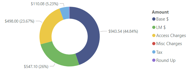
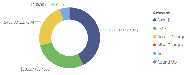
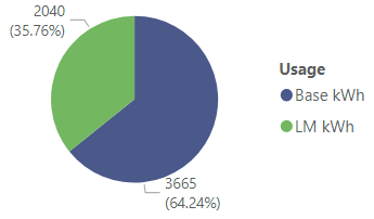
For a visual comparison of our total spend, here's 2020's donut chart:
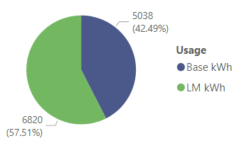
Compared to 2019, not much beyond the difference in load management is visible:
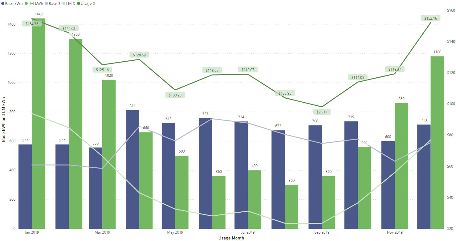
As I've noted before, we had everyone at home all the time for the vast majority of this pandemic. This in itself is an unusual pattern compared to "normal" years. As I speculated, it has been interesting to see what I believe to be the "battery-powered device" phenomenon impact our usage overall, specifically when the children were in school, either at home or as they were able to be in person this fall. The 2019 usage pattern is pretty steady through the year. The base load stays pretty consistent, and the load management usage fluctuates accordingly with the weather (temperature averages are the yellow line):
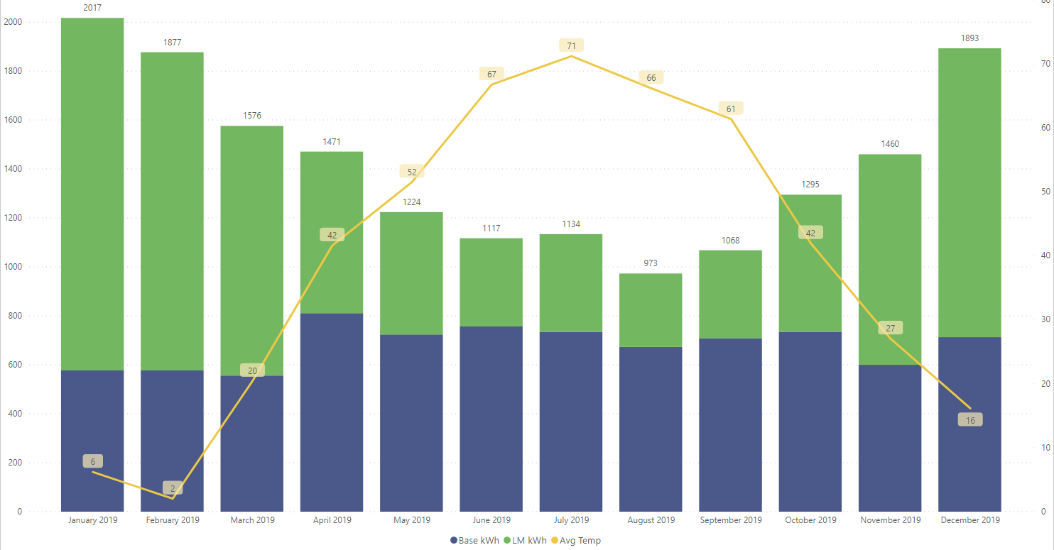
Usage in 2020, however, was much more "volatile" in its base load (the blue bars):
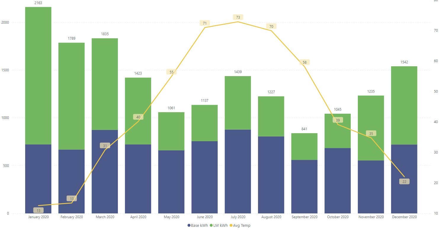
One thing that changed our usage dramatically was the major insulation job we completed in July. In essence we had a whole-house air sealing job completed, bolstered with fresh insulation in the attic (and injected foam in the walls). This is visible in the size of the green bars beginning in August. It's not obvious in these charts (this shows up in the tabular data very well), but on the whole the "volatility" of the 2020 base load (blue bars) are overall reductions in our usage (compared to the same month in 2019). When the bars change dramatically year over year, it's usually lower base usage.
I have compartmentalized some views into "seasons" where heating and cooling are involved. This is pretty simple for the cooling season (since it's all months in the same year), but a bit more complex for the heating season as it crosses a year boundary. But it makes more sense in many ways to think about the heating season as it compares to a "winter," which crosses a year boundary.
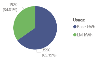
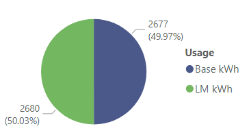
In my quick analysis, the cooling season pie charts aren't particularly different year over year (2019 at left, 2020 at right):
We consumed more load management kWh in 2020 in part because it was a warmer year, but likely more so due to the insulation job since it took place during a particularly warm stretch and over two days. During that time, all of our attic insulation was removed, and it was a Most Unpleasant time with heat and humidity.
The heating season charts are slightly more interesting, but we're not yet through the 2020-21 heating season so the data is incomplete. That said, the 2020-21 chart includes usage for January 2021, so it's worthy of including since two of the three highest load management usage months (December and January) are included. This is where the difference in our insulation starts to show through (2019-20 at left, 2020-21 to date at right):
We have a lot of fixed cost in our electric bill (just over 1/4 of the total dollars -- the light blue (tax) and yellow (access charges and fees) segments of the opening donut charts), so I find it helpful to really look at the dollars spent for the actual electricity consumed since such a large segment of our bill is fixed which easily skews the data. The charts below illustrate usage (bars, in kWh by type) and their associated dollar values (lighter-colored lines, in $ by type). The dark green line with labels is the total $ spent on actual electricity per month.
In 2019 our spend distribution looked like this:
For 2020, the distribution was such:
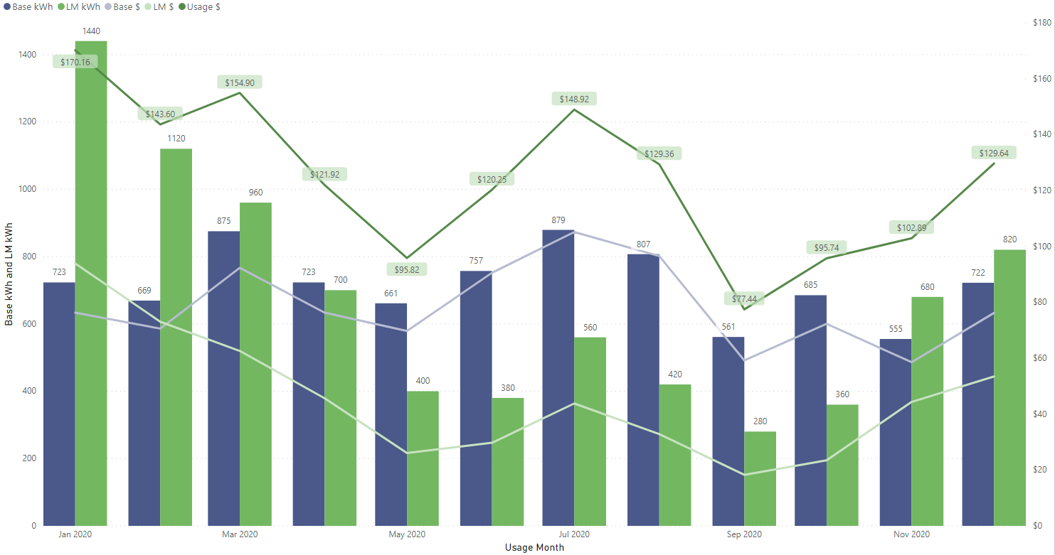
The base usage in July and August of 2020 is speculated to be more volatile (and higher than 2019) due to the renovation projects we had started (roofing, siding, new windows and insulation), as contractors were on hand and working.
With only two months of the three coldest (and thus highest load management usage) under our belt since the insulation project, it's difficult to adequately compare. However, a dramatic trend is visible in the data.
For the month of December (2020) we consumed 820 kWh for load management ($53.46). However, this is shockingly different than December 2018 (1,440 kWh -- $93.89) and 2019 (1,180 kWh -- $76.94) usage. Between 30% and 43% less use for one month.
In January (2021) we also consumed 820 kWh for load management ($53.46), but compared to January 2020 (1,440 kWh -- $93.89) and 2019 (1,440 kWh -- $93.89) it is unreal. 43% less usage!
Those identical kWh usage numbers aren't typos -- it's really interesting to see how several months in the history have similar or identical readings. This makes some sense, though, because with the heat pump we keep a constant setpoint all season long, and our long-standing water heating history/usage is pretty consistent.
Now that I have this PowerBI report built, I keep using it each month to do a quick analysis of our usage, just from a visual standpoint. I will probably dig in again after the heating season ends (sometime in May) to see how the overall season compared against those previous. Regardless, it's fun to look at this data in aggregate and meaningful ways (at least for me). Without a lot of effort (having the data in an existing spreadsheet made this far simpler), pulling this sort of thing together was "relatively" easy.
I was a speaker at MMSMOA, May 3-7, 2026!

I was a speaker at MMS Music City Edition, October 12-15, 2025!

I was a speaker at TCSMUG Autopilot/OSD Day, July 15, 2025!
![]()
I was a speaker at MMSMOA, May 4-8, 2025!
I was a speaker at BrainStorm K20 Wisconsin Dells, March 9-11, 2025!

I was a speaker at MMS Flamingo Edition, October 20-23, 2024!

I was a speaker at TCSMUG OSD Day, July 31, 2024!
![]()
I was a speaker at NWSCUG, July 19, 2024!
![]()
I was a speaker at MMSMOA, May 5-9, 2024!
I was a speaker at BrainStorm K20 Wisconsin Dells, March 10-12, 2024!
I was a speaker at MMS Miami Beach, October 29-November 1, 2023